Choosing the right color palette can feel like navigating a vast, vibrant universe. Whether you’re a budding designer, a small business owner, or simply looking to refresh your personal aesthetic, the power of a well-chosen color palette is undeniable. It evokes emotions, communicates your message, and ultimately shapes how the world perceives you or your brand. But fear not! This guide will demystify the process, showing you exactly how to pick the right color palette with the confidence of a seasoned professional.
Understanding the Fundamentals of Color Palettes
Before diving into specific choices, let’s grasp some key concepts that underpin effective color palette selection.
The Color Wheel: Your Visual Compass
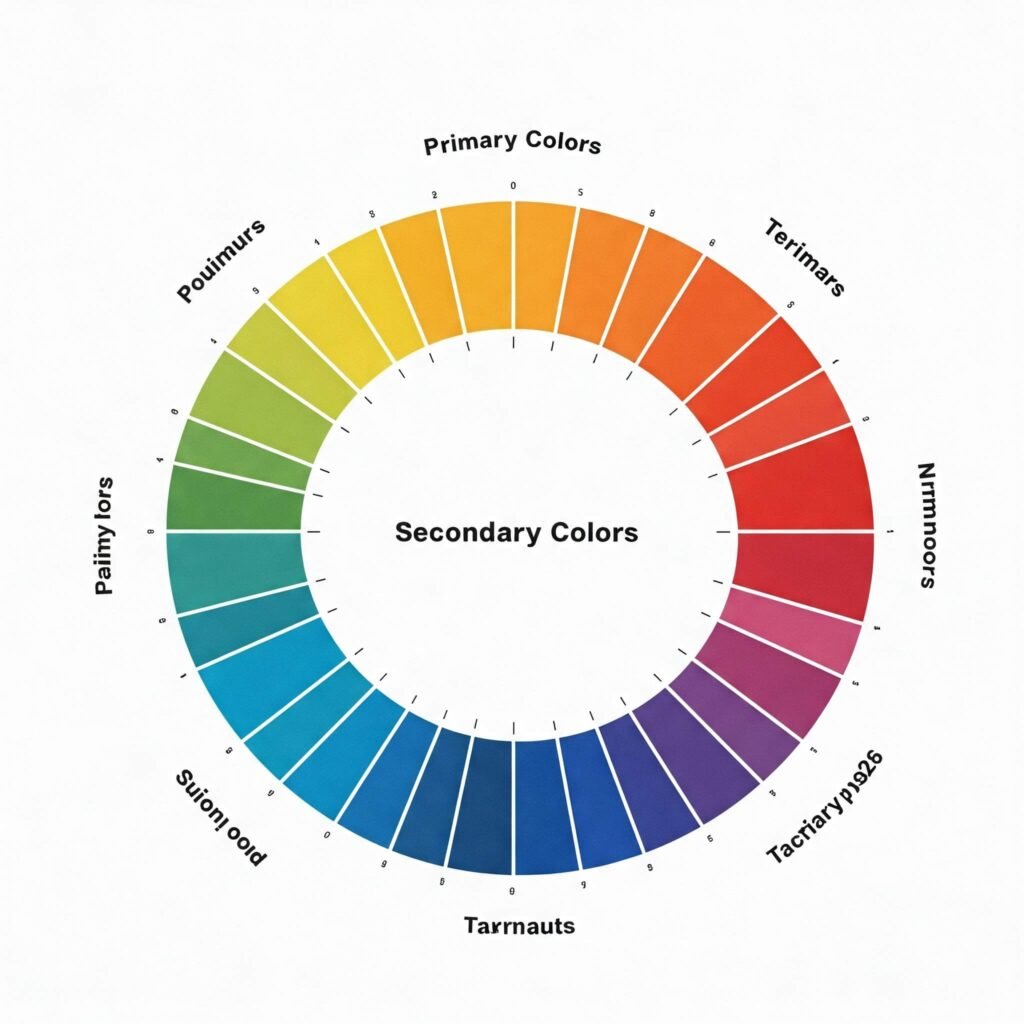
The color wheel is the foundation of color theory. Understanding its components is crucial for building harmonious color palettes:
- Primary Colors: Red, yellow, and blue. These are the base colors from which all others are derived.
- Secondary Colors: Orange, green, and violet. Created by mixing two primary colors.
- Tertiary Colors: Colors formed by mixing a primary and a secondary color (e.g., red-orange, blue-green).
Color Harmonies: Creating Visual Balance
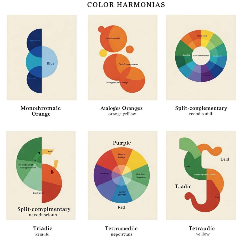
Color harmonies are tried-and-true combinations that create aesthetically pleasing color palettes. Here are a few essential ones:
- Monochromatic: Uses variations (tints, shades, and tones) of a single color. Creates a sophisticated and unified look.
- Analogous: Features colors that are adjacent to each other on the color wheel. Offers a harmonious and serene feel.
- Complementary: Pairs colors directly opposite each other on the color wheel. Creates high contrast and vibrancy.
- Split-Complementary: Uses one base color and the two colors adjacent to its complement. Offers high contrast but is less jarring than a purely complementary palette.
- Triadic: Employs three colors that are equally spaced on the color wheel. Creates a balanced and vibrant palette.
- Tetradic (or Double Complementary): Uses two sets of complementary colors. Offers richness and complexity but requires careful balancing.
How to Pick the Right Color Palette for Your Needs
Now, let’s get practical. Here’s a step-by-step guide on how to pick the right color palette for your specific goals:
1. Define Your Purpose and Brand Identity
- What message do you want to convey? Consider the emotions and associations different colors evoke. For example, blue often represents trust and stability (HubSpot), while yellow can signify optimism and energy (McDonald’s). [Outbound Reference Link: Link to an article discussing color psychology in branding, e.g., from 99designs or Canva.]
- Who is your target audience? Different demographics may respond differently to certain colors. Research your audience’s preferences and cultural associations with color.
- What is your brand personality? Are you playful, sophisticated, energetic, or calming? Your color palette should reflect this.
2. Research and Inspiration for Your Color Palette
- Look at what others are doing: Analyze the color palettes of successful brands or designs in your field. This can provide valuable insights and inspiration.
- Explore online tools: Websites like Adobe Color [Outbound Reference Link: Link to Adobe Color], Coolors [Outbound Reference Link: Link to Coolors], and Paletton offer powerful tools for generating and exploring color palettes.
- Find inspiration in the real world: Nature, art, fashion, and even food can be fantastic sources of unique color palette ideas.
3. Start with a Base Color for Your Color Palette
- Your base color is often tied to your brand’s core identity or the primary feeling you want to evoke.
- Consider your logo or existing visual elements as a starting point for your color palette.
4. Build Your Secondary and Accent Colors
- Secondary colors support your base color and provide visual interest. Think about the color harmonies discussed earlier to guide your choices.
- Accent colors are used sparingly to highlight key elements and add pops of energy. They often come from complementary or contrasting parts of the color wheel.
5. Consider Neutral Colors for Balance
- Neutrals like white, black, gray, beige, and cream provide a backdrop and help to balance bolder colors in your color palette.
- Don’t underestimate the importance of neutrals in creating a sophisticated and readable design.
6. Test and Refine Your Color Palette
- See your colors in action: Apply your chosen color palette to mockups of your website, marketing materials, or design projects.
- Get feedback: Ask others for their opinions on your color palette. Does it effectively communicate your message? Is it visually appealing?
- Iterate and adjust: Don’t be afraid to tweak your color palette until you’re completely satisfied.
Key Considerations for Picking the Right Color Palette
- Accessibility: Ensure sufficient color contrast between text and background for readability, especially for users with visual impairments. 1 [Outbound Reference Link: Link to a resource on web accessibility guidelines (WCAG).] 1. www.frontendmentor.io www.frontendmentor.io
- Cultural Sensitivity: Be aware that colors can have different meanings and associations across cultures.
- Consistency: Maintain a consistent color palette across all your branding and design materials to build recognition and trust.

Conclusion: Mastering the Art of the Color Palette
Learning how to pick the right color palette is an ongoing journey of exploration and refinement. By understanding the fundamentals of color theory, considering your specific needs, and experimenting with different combinations, you can unlock the visual potential of your brand or personal style. Embrace the power of color and watch your designs come to life!


