
")
")
")
")
")
")
")
")
")
")
")
")
")
")
")
")
")
")

Okay, so here’s the thing about how to pick the right color palette — nobody tells you how weirdly emotional it gets. Like, you think you’re just choosing a few colors. Cute little swatches. No big deal. And then suddenly you’re standing in the paint aisle at Home Depot at 7:42 p.m., holding two nearly identical shades of off-white, questioning every decision you’ve ever made.
Is it just me? Or does “Warm Cloud” feel judgmental?
Anyway. Hi. I live in the US. I’ve written a few hundred blog posts in my life. Some slapped. Some… did not. People liked enough of them to keep me going, which is basically how I approach color palettes too. Trial, error, mild regret, occasional genius.
So let me tell you what I’ve learned — not like a design god, more like a friend who’s messed this up enough times to warn you where the emotional potholes are.
The First Time I Absolutely Botched a Color Palette
True story.
I once painted my bedroom three different shades of blue in one weekend.
Not on purpose.
I started with what I thought was a calm, coastal blue. It dried… and looked like a dentist’s waiting room. So I panicked and bought a deeper blue. That one felt moody, like I might start writing sad poetry. Finally, I slapped on a lighter version and called it “intentional.”
My friend walked in, looked around, and said:
“Are you… okay?”
That’s when I realized picking a color palette isn’t about being artistic. It’s about having a plan before you emotionally spiral.
Why Picking Colors Feels So Personal (and Kinda Unhinged)
Colors aren’t neutral. They just aren’t.
They remind us of stuff.
That green might remind you of your grandma’s kitchen.
That yellow? A school bus. Or mustard. Or a breakup sweater you wore too often.
When you’re trying to figure out how to pick the right color palette, you’re not just designing a space — you’re unpacking memories you didn’t know were hiding in Sherwin-Williams.
Fun!
Step One: Start With One Color You Actually Love
Not one you think you should love.
Not one Pinterest told you was “in.”
One color that, when you see it, your brain goes: oh. yeah. that one.
For me? It’s a dusty, moody green.
The kind that looks like it belongs in a slightly haunted library.
Start there. Just one color. This is your anchor. Your emotional support swatch.
Everything else can orbit around it.
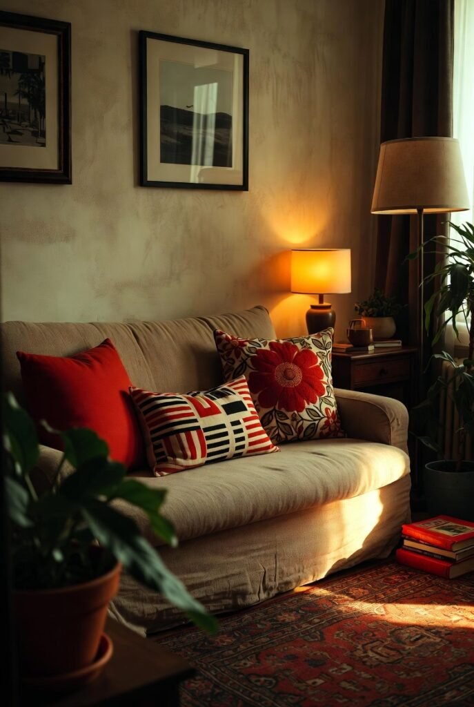
The 60–30–10 Rule (Which Sounds Fake but Works)
I resisted this rule for YEARS because it felt too… math-y.
But listen. It works.
Here’s the deal:
- 60% = main color (walls, big furniture, the vibe)
- 30% = secondary color (rugs, curtains, chairs)
- 10% = accent color (pillows, art, random objects you impulse-bought)
That 10%? That’s where you get weird.
That’s where mustard yellow lives. Or rust. Or that teal you’re afraid of.
You don’t marry the accent color.
You just flirt with it.
Stop Choosing Colors Under Fluorescent Lighting (Please)
This is me begging.
Paint stores are liars.
Lighting is a liar.
Your phone screen? A known criminal.
Always — ALWAYS — test colors at home.
Tape the swatch to the wall. Walk past it at different times of day. Glance at it while brushing your teeth. Side-eye it while eating leftovers at midnight.
If it still feels good after three days?
Congrats. You might have found the one.
Undertones: The Sneaky Villain Nobody Warns You About
Here’s where things get spicy.
Two colors can look identical… until they’re next to each other. Then suddenly one looks pink. Or green. Or vaguely sick.
That’s undertones.
Warm vs cool matters more than the color itself.
- Warm whites = creamy, cozy, inviting
- Cool whites = crisp, modern, slightly judgmental
Mixing undertones without realizing it is how rooms end up feeling “off” without anyone knowing why.
(You ever walk into a space and feel unsettled but can’t explain it? Undertones. Every time.)
Use Your Closet. I’m Serious.
Want a cheat code for how to pick the right color palette?
Open your closet.
What colors dominate?
Black and gray? You like calm, grounded palettes.
Earth tones? Warm, cozy vibes.
Bold colors everywhere? You’re braver than you think.
We already surround ourselves with colors we love. We just forget to notice.
Also, if your closet is chaos — same. That just means eclectic might be your thing.
The Internet Will Confuse You. That’s Normal.
Pinterest is helpful.
Instagram is inspiring.
Both will absolutely mess with your head.
One minute you love warm beige.
Five scrolls later, you’re convinced your entire home should be sage green with brass accents and a $4,000 sofa.
Take inspiration, not instructions.
Save what feels right — then walk away for a day. See what still sticks.
A Quick Note on Trends (Because Someone Has to Say It)
Trends are fun.
Trends are also temporary.
Remember millennial gray?
Yeah.
If you love a trend, use it in ways that are easy to undo:
- Pillows
- Throws
- Art
- Small furniture
Not your entire identity. Or your walls.
When in Doubt, Neutrals Aren’t Boring — They’re Brave
Hot take.
Neutrals get a bad rap because people think they’re “safe.”
But a good neutral palette? It’s intentional. It lets texture, light, and life do the talking.
Layer different shades. Mix materials. Add contrast.
Beige doesn’t have to mean boring.
It can mean calm. Or grown. Or “I finally slept eight hours.”
The Moment You’ll Know It Works
There’s this quiet moment — usually when you’re not trying — where you walk into the room and just… exhale.
Nothing jumps out.
Nothing feels wrong.
That’s when you know you figured out how to pick the right color palette.
Not because it’s perfect.
But because it feels like you.
A Couple Places I Love for Color Inspiration (Without the Noise)
- A Beautiful Mess (their older posts especially — super human, very real): https://abeautifulmess.com
- Wes Anderson color breakdowns (because obviously): https://www.youtube.com/results?search_query=wes+anderson+color+palette
Just don’t fall down the rabbit hole for three hours. (You will.)
Final Thought (Not a Conclusion, Relax)
You’re allowed to change your mind and allowed to repaint.
You’re allowed to hate a color you once loved.
That’s not failure. That’s taste evolving.
And honestly? The pros mess this stuff up too. They just don’t post about it.
Now go pick a color. Or three.
And if it goes sideways — welcome to the club.

")
")
")
")
")
")
")